BUCK IN-APP ANIMATIONS
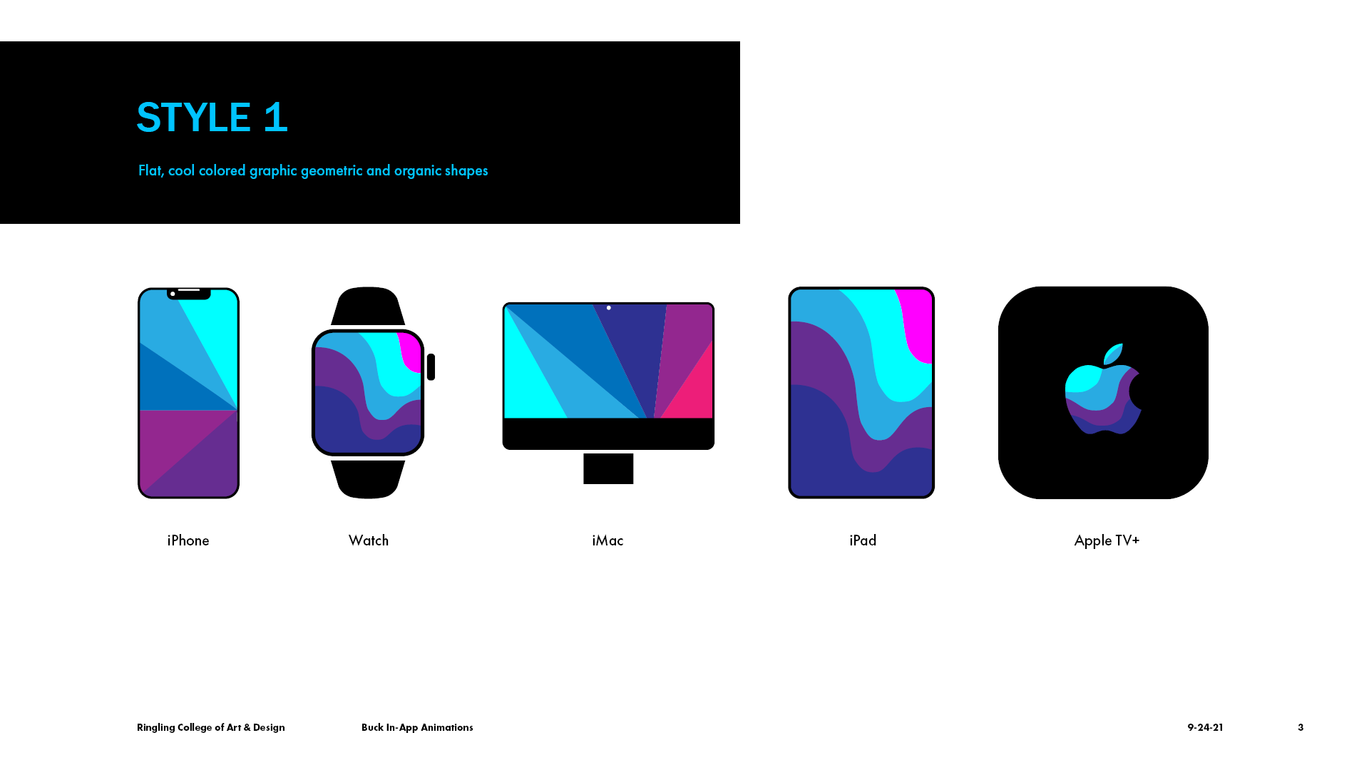
I worked on a personal project for my client, Apple. I designed a cohesive set of 5 looping animated illustrations for each of Apple's products which are the iPhone, iPad, Watch, iMac, and Apple TV +.
PROCESS
STYLE 1
STYLE 2
Style 1 was designed as flat, cool colored graphic geometric and organic shapes. Style 2 was designed to be illustrated with grainy textures. Style 1 was chosen.
1ST PASS
I revised the color of the shapes to fit with the colors that Apple uses. A first pass animation was created to see how one of the icons would animate. I added a glow effect to give a more aesthetic appearance to the designs of the 5 icons.
2ND PASS
I animated all 5 of the icons that display the new features they represent for my second pass. The shapes have organic angles instead of sharp angles to keep the design style cohesive.
3RD PASS
I redesigned the curves of the shapes to be smoother, and worked on the pacing of the animated shapes, such as the heart pulse for the watch and for the rest of the icons.
I created a mock-up of how the icon would look as an actual app animating on an iPhone.
PROCESS SCREENSHOTS
FINAL
I revised separating the shapes more when they animate, changing the Apple TV + icon into the square device with the "TV" text and remote, and other additional revisions to the rest of the icons.
I also redesigned a final mock-up of all 5 animations as apps on an iPhone 13 Pro.


